I had to design kind of an infographic for my MMP2. It should show you the different steps when you visit the hospital. So when I thought about the design I decided to do a flat design. But why?
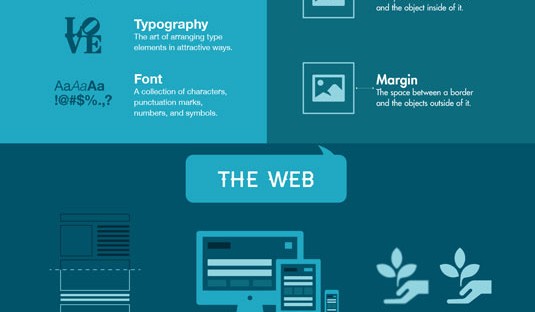
Flat designs are really clear, the have open space, bright colors and flat illustrations. Like this you reduce your design on the basics. So it is really minimalistic which helps you to orientate really fast. The message get conveyed more quickly than in a detailed illustration.
So I thought this would be the best option to explain these sequences in a fast way.
Source: Flat Design


